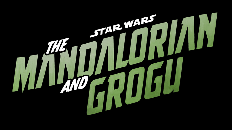
When Star Wars: The Mandalorian and Grogu revealed their official logo, it didn’t just drop a title; it quietly told us everything about where the story is going. At Meaning in the Making, we believe this isn’t just branding for a streaming show anymore; it’s a visual masterclass built for the scale of the big screen.
The Architecture of Strength: Forged Typography
The word “MANDALORIAN” is doing most of the visual work. The letters are tracked tightly together, almost uncomfortably close. This removes any sense of softness, turning the word into a single, solid mass.
Why Spacing Matters
Tight kerning creates a block-like, architectural feel. It mirrors something physical, something forged.
- The Symbolism: Much like Beskar armor, the typography is dense and durable.
- The Brand Message: Strength, discipline, and identity are embedded in the spacing alone. Most people won’t consciously notice the tracking, but they will feel the weight of it.
The Narrative Shift: Elevating Grogu
In earlier branding, Grogu was a cultural phenomenon but not a visual priority. In the 2026 film logo, that changes. “AND GROGU” isn’t small or tucked away; it’s bold, integrated, and impossible to ignore.
By giving Grogu equal visual weight, the design confirms what the story has been building toward. This is no longer a story about a lone warrior; it’s about a unified father-son duo. The design reflects this shift in hierarchy without needing a single line of dialogue.
Color Psychology: Military Meets Maturity
The muted green tone feels grounded, almost military, aligning naturally with Mandalorian culture. However, it also subtly echoes Grogu himself.
- Muted Tones: This isn’t a playful green; it’s toned down and mature.
- The Bridge: This creates a visual bridge between the hardened warrior and a child with immense power.
The Director’s Take: The slight forward angle of the text gives the logo momentum. It doesn’t feel static; it feels like it’s pushing ahead toward a theatrical destination.
2026 Trends: The Return to Heritage
This design fits into a larger trend we’ve seen across branding this year: a return to authority. Instead of chasing minimalism, brands are leaning into structure and legacy.
As we analyzed in our Burberry Logo Analysis: Why Luxury Brands are Switching Back to Serif Fonts – Meaning in the Making, legacy brands are reclaiming their roots to find permanence. The Mandalorian and Grogu logo follows this exact logic. It doesn’t feel temporary; it feels like it belongs to the history of cinema.
If you enjoyed this deep dive into the “Why” behind your favorite brands and want to see more posts like this, visit us at Meaning in the Making for more insights on design, strategy, and the stories behind the logos.